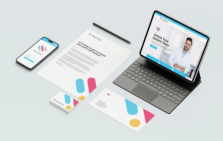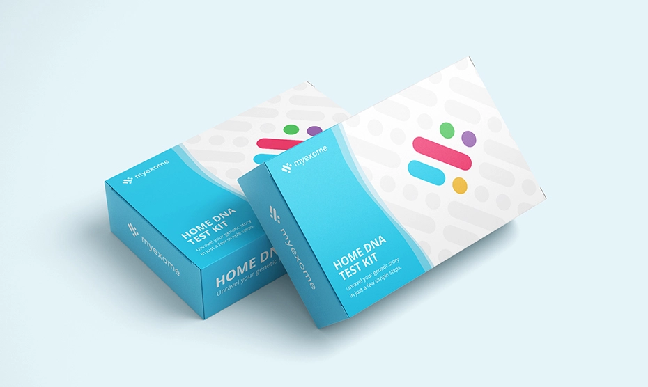
The CEO of MyExome sought a designer to craft a fresh logo for their company, part of a strategic re-launch initiative. MyExome specializes in distributing at-home DNA testing kits for fitness, nutrition, and health.
Their prior logo, while fitting, leaned a bit too heavily into a scientific aesthetic. They aimed for a design that retained elements of scientific credibility while emphasizing health in a more subtle manner.
The concept I devised revolves around a heart-shaped motif, a universally recognizable symbol of vitality and wellness. Within this heart-shaped outline, five smaller shapes collectively form the molecular structure, subtly hinting at the intricate composition of molecules.
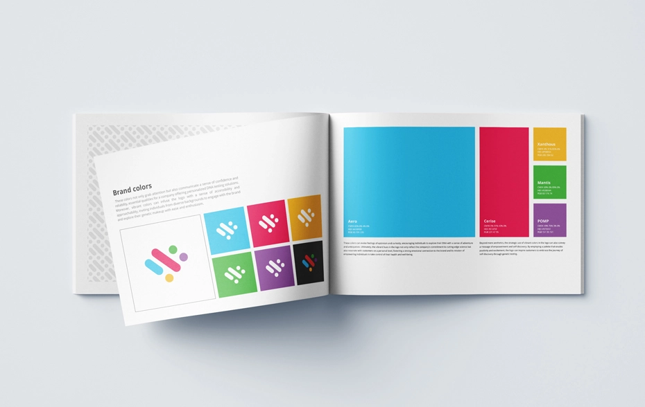
The chosen color palette complements this theme by evoking the intricate nuances of DNA. It conveys the multifaceted complexity of genetic makeup and its impact on overall well-being. Moreover, the vibrant hues diverge from the previous corporate tones, fostering a more approachable image for the company.
This refreshed palette not only injects a sense of enjoyment into the DNA testing process but also ensures inclusivity by eschewing gender-specific colors. Most importantly, it enhances the logo's visual impact, making it more dynamic and memorable.


