An enthusiastic entrepeneur with a clear vision of his startup company tasked me to create a logo and a visual branding guide for his South Asia based travel agency, Tooka Travel.
Tooka Travel use advanced technology to tailor each journey for the endivisual traveller, emphasizing that the journey itself is more important than the final destination, and every step of the way should be filled with discovery and excitement.
Before I was approached, my client had already gathered plenty of material for the project, and outlined a clear idea of what he wanted to logo to convey, however, what he was initially asking for did not align well with his target audience, so I spend some time before kicking off the project to guide/educate my client and re-align his expectation of what his future logo should convey to reach his target audience. The owner of Tooka Travel was very susceptible and thankful for my guidance, a bliss to work with, and we quickly progressed to the next step of the project.
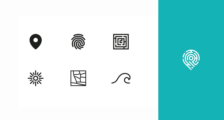
The Tooka Travel logo, a fusion of the classic map pin and a fingerprint, together encapsulates the essence of personalized travel. The map pin, a universal well known symbol for locations, signifies Tooka’s role in guiding customers through their journeys. It emphasizes the entire travel experience, not just the destination, and can represent any travel experience. The fingerprint pattern adds a unique, personal touch, symbolizing each traveler’s unique journey. Its pattern, similar to a map or a maze, reinforces the travel imagery and symbolizes the complexities of the journey ahead. This positions Tooka as a trusted tour guide, helping customers discover hidden gems and unforgettable experiences. Inspiration was also drawn from other places, such as the sun, the shape of a wave and more. In essence, the Tooka Travel logo visually represents the company’s mission to provide personalized, comprehensive travel experiences, creating a memorable symbol as unique as the journeys it represents.
